> ## Documentation Index
> Fetch the complete documentation index at: https://documentation.idenfy.com/llms.txt
> Use this file to discover all available pages before exploring further.
# Branding (KYB)
> Create and manage KYB branding themes in the iDenfy dashboard to white-label the business verification form with your logo, fonts, and colors.
**Location:** **Settings** → **Business Verifications (KYB)** → **Configurations** → **Branding**
KYC (identity verification) branding is managed separately under **Settings** → **Know Your Customer (KYC)** → **Branding**. Both products share the same multi-theme management interface. See [Branding (KYC)](/guides/dashboard/settings/kyc-branding).
The Branding section lets you create and manage multiple personalization themes for the KYB verification form. Each theme defines the visual identity shown to clients during business verification — logo, colors, font, company name, and support email. You can assign a different theme to each KYB session or flow.
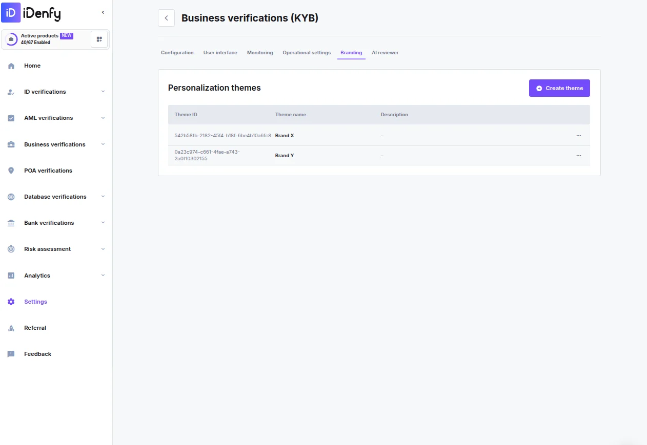 ***
## Managing Themes
The **Personalization themes** overview lists all configured themes:
| Column | Description |
| --------------- | --------------------------------------- |
| **Theme ID** | Unique identifier for the theme |
| **Theme name** | Internal label shown in the themes list |
| **Description** | Optional notes for team context |
Click **Create theme** to add a new theme. Use the action menu on any existing theme row to edit or delete it.
***
## Creating or Editing a Theme
### Configuration
| Field | Description |
| --------------------- | --------------------------------------------------------------------------- |
| **Theme name** | Internal label displayed in the themes list (required) |
| **Theme description** | Optional notes for team context |
| **Company name** | Public-facing company name shown to clients during the verification process |
| **Support email** | Contact email shown to clients during the verification flow |
### UI Files
***
## Managing Themes
The **Personalization themes** overview lists all configured themes:
| Column | Description |
| --------------- | --------------------------------------- |
| **Theme ID** | Unique identifier for the theme |
| **Theme name** | Internal label shown in the themes list |
| **Description** | Optional notes for team context |
Click **Create theme** to add a new theme. Use the action menu on any existing theme row to edit or delete it.
***
## Creating or Editing a Theme
### Configuration
| Field | Description |
| --------------------- | --------------------------------------------------------------------------- |
| **Theme name** | Internal label displayed in the themes list (required) |
| **Theme description** | Optional notes for team context |
| **Company name** | Public-facing company name shown to clients during the verification process |
| **Support email** | Contact email shown to clients during the verification flow |
### UI Files
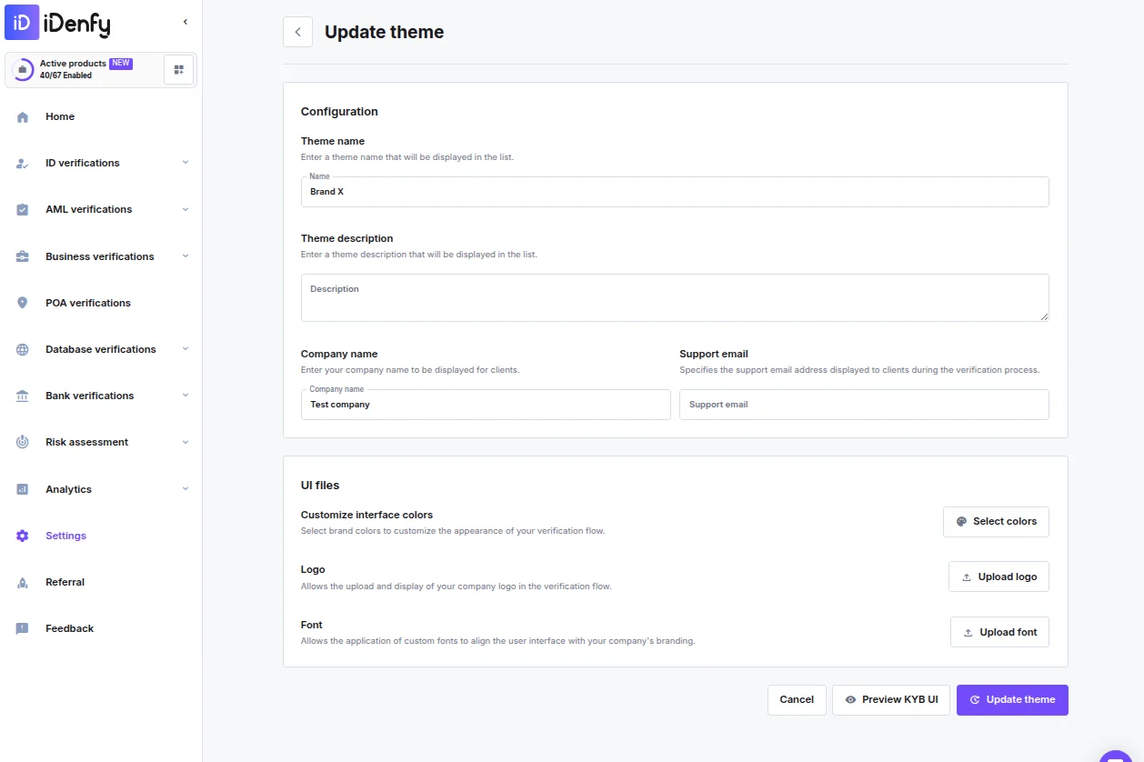 | Asset | Format | Max size | Description |
| ------------------------------ | ---------------- | -------- | --------------------------------------------------------------------- |
| **Customize interface colors** | — | — | Open the color picker to configure your brand palette across two tabs |
| **Logo** | SVG | 5 MB | Company logo shown in the header of the verification form |
| **Font** | `.otf` or `.ttf` | 5 MB | Custom brand font applied across the interface |
### Interface Colors
Click **Select colors** to open the color picker. Colors are split across two tabs:
**Main UI colors**
| Color | Purpose |
| -------------------------------- | --------------------------------------------------- |
| Primary brand color | Core brand color for buttons, links, and highlights |
| Primary background color | Main canvas background |
| Secondary brand color | Secondary accent color |
| Secondary background color | Card and panel backgrounds |
| Typography color | Default body text color |
| Disabled typography color | Color for inactive or disabled text |
| Success state color / background | Approved steps and completed actions |
| Error state color / background | Failed checks and validation errors |
| Warning state color / background | Quality alerts |
| Info state color / background | Neutral informational messages |
**Other UI colors** — Additional interface color overrides.
Click **Save** when done.
### Preview
Click **Preview KYB UI** in the bottom toolbar to see a mock-up of the verification form with your theme applied before saving.
***
## Permissions
| Permission | What it allows |
| ---------------------------- | ------------------------------------------------------------------------------ |
| Manage KYB Dynamic Workflows | Create, edit, and view dynamic workflows |
| Generate KYB Token | View and assign dynamic workflows when creating sessions, but cannot edit them |
| Asset | Format | Max size | Description |
| ------------------------------ | ---------------- | -------- | --------------------------------------------------------------------- |
| **Customize interface colors** | — | — | Open the color picker to configure your brand palette across two tabs |
| **Logo** | SVG | 5 MB | Company logo shown in the header of the verification form |
| **Font** | `.otf` or `.ttf` | 5 MB | Custom brand font applied across the interface |
### Interface Colors
Click **Select colors** to open the color picker. Colors are split across two tabs:
**Main UI colors**
| Color | Purpose |
| -------------------------------- | --------------------------------------------------- |
| Primary brand color | Core brand color for buttons, links, and highlights |
| Primary background color | Main canvas background |
| Secondary brand color | Secondary accent color |
| Secondary background color | Card and panel backgrounds |
| Typography color | Default body text color |
| Disabled typography color | Color for inactive or disabled text |
| Success state color / background | Approved steps and completed actions |
| Error state color / background | Failed checks and validation errors |
| Warning state color / background | Quality alerts |
| Info state color / background | Neutral informational messages |
**Other UI colors** — Additional interface color overrides.
Click **Save** when done.
### Preview
Click **Preview KYB UI** in the bottom toolbar to see a mock-up of the verification form with your theme applied before saving.
***
## Permissions
| Permission | What it allows |
| ---------------------------- | ------------------------------------------------------------------------------ |
| Manage KYB Dynamic Workflows | Create, edit, and view dynamic workflows |
| Generate KYB Token | View and assign dynamic workflows when creating sessions, but cannot edit them |