Web UI customization
You can customize the look and feel of our platform to suit your company's theme better.
Customizable objects
- Logo
- Primary color
- Secondary color
- Hovered button color
- Disabled icon button color
- Disabled button typography(text) color
- Disabled button color
- Typography(text) color
- "Success" message color
- "Success" message background
- "Error" message color
- "Error" message background color
- "Warning" message color
- "Warning" message background color
- "Info" message icons color
- "Info" message background color
- Primary Background color
- Secondary background color
Additional personalisation settings and whitelabel features
- Immediate redirect
- Show idenfy water mark
- Show alternative methods
- Show header timer
- Show footer
- Skip waiting for results
- Support email
- Minimum camera quality
- Recommended camera quality
All of these settings can be reached from your main Dashboard > Configuration tab > Personalisation tab. Only managers with sufficient permissions can make changes there.
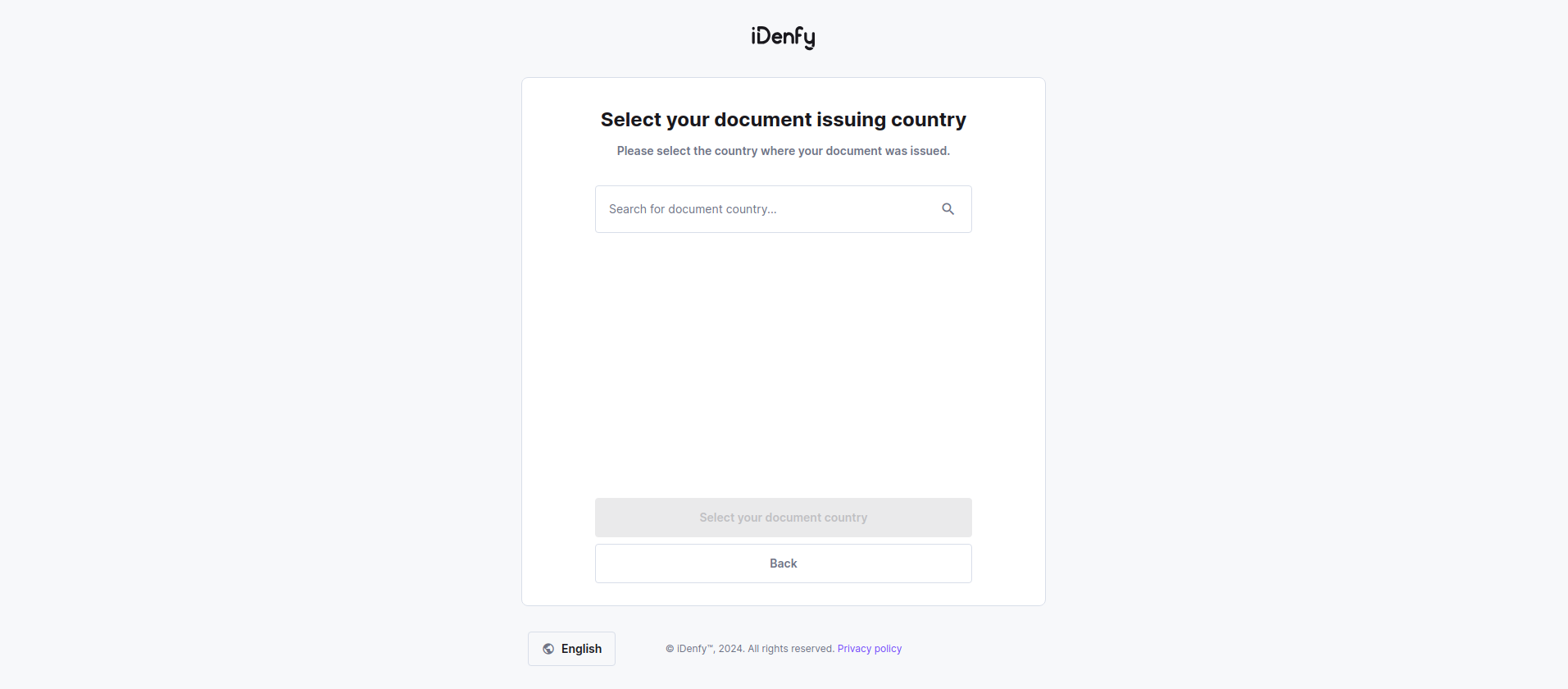
Default view
Default platform view without customization.
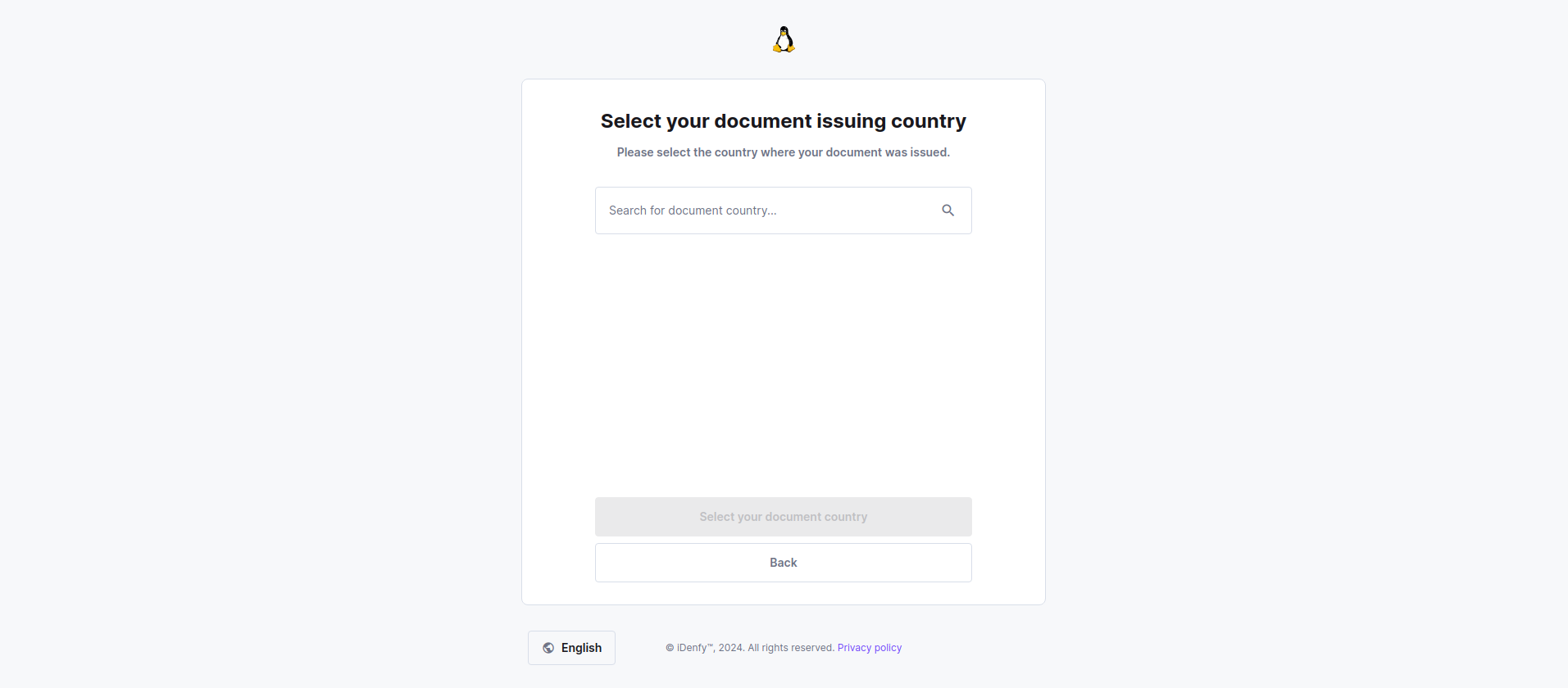
Logo customization
You can provide your company's logo to replace our company's logo. This way your customers may feel that they are still using your company's functionality.
Provided logo must be in .svg format.
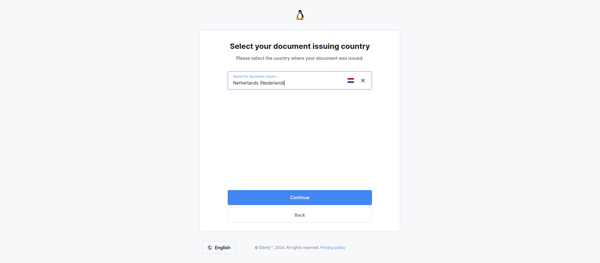
Primary color
You can change the primary color of your layout.
Provided colors must be in hex format e.g. #4286f4
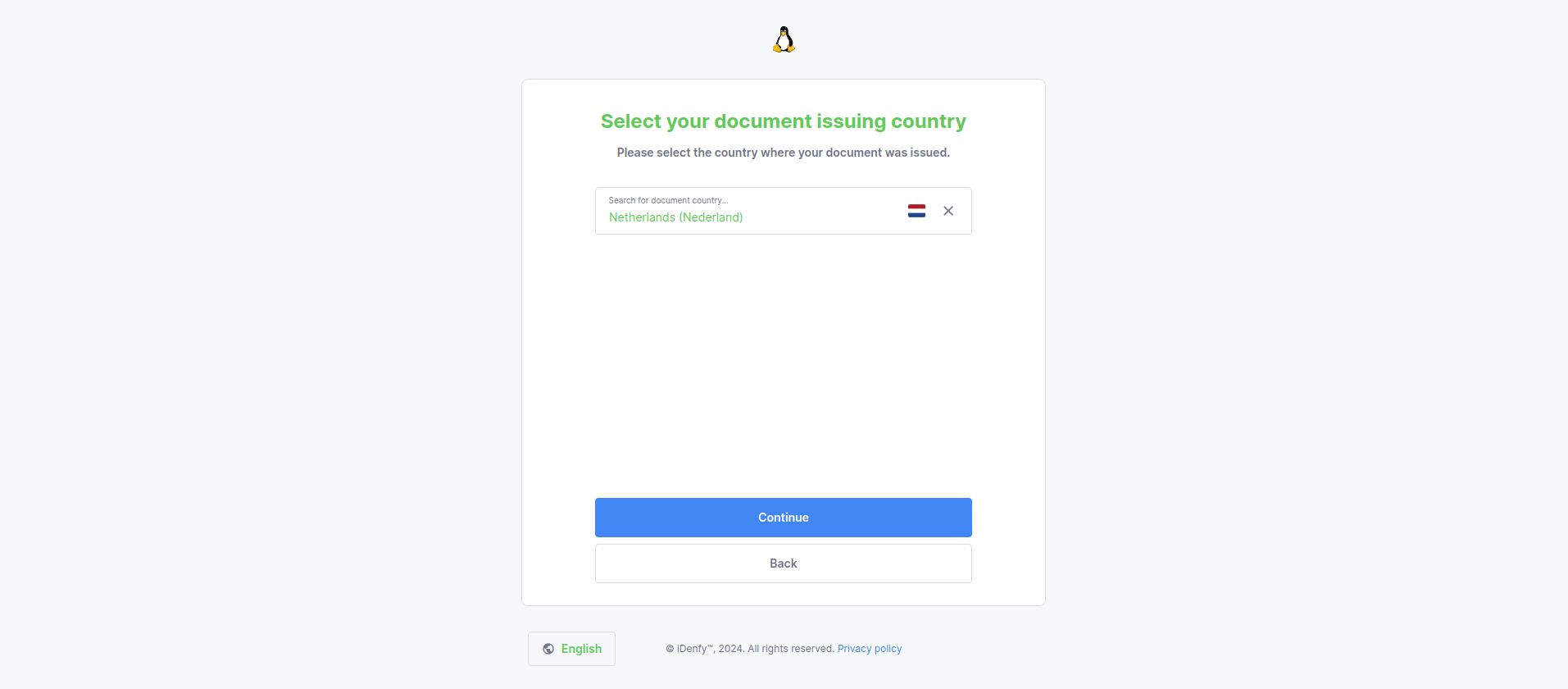
Secondary color
You can add a secondary color in addition to your primary color's style.
Hovered button
You can change the color of the buttons when you hover your mouse cursor over them.
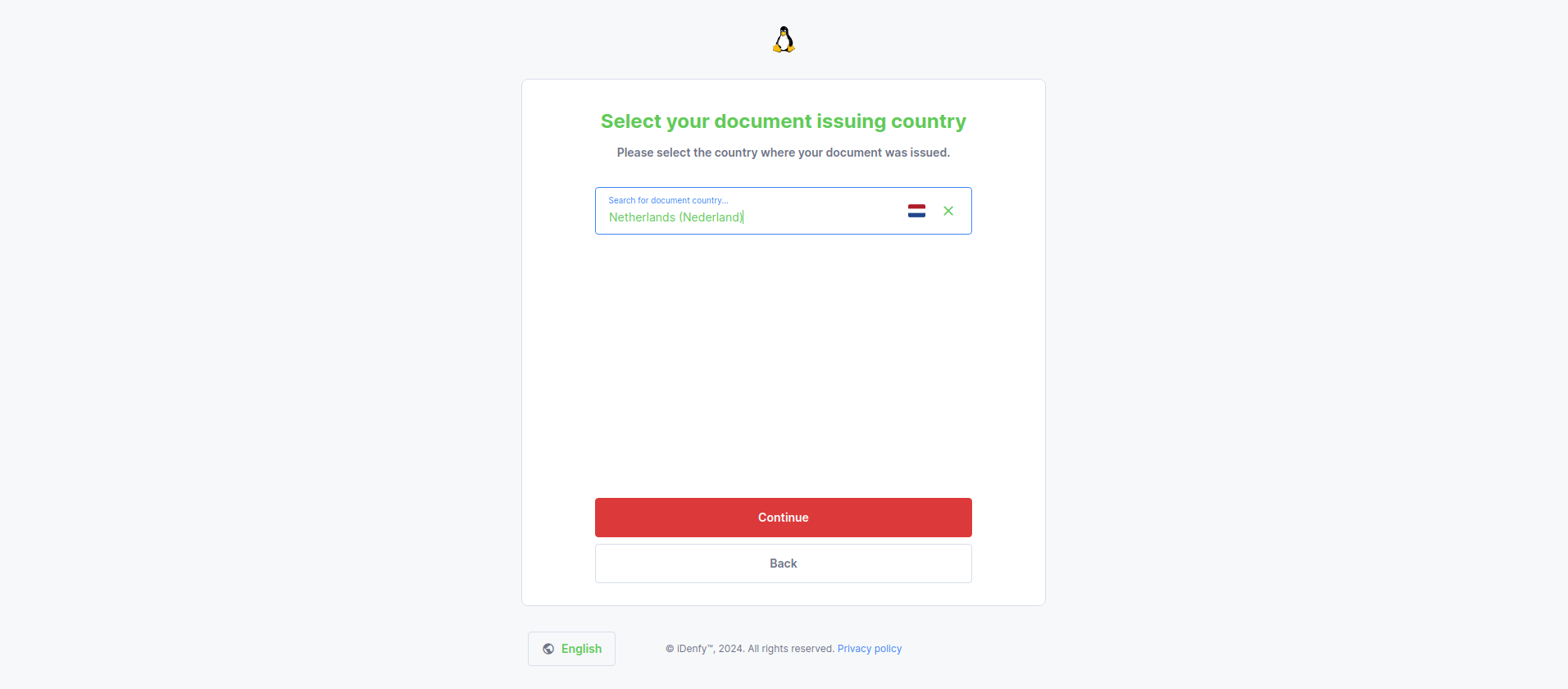
Disabled icon button
You can change the colors of the inactive icon buttons.
Disabled button typography(text) color
You can change the text color of disabled buttons.
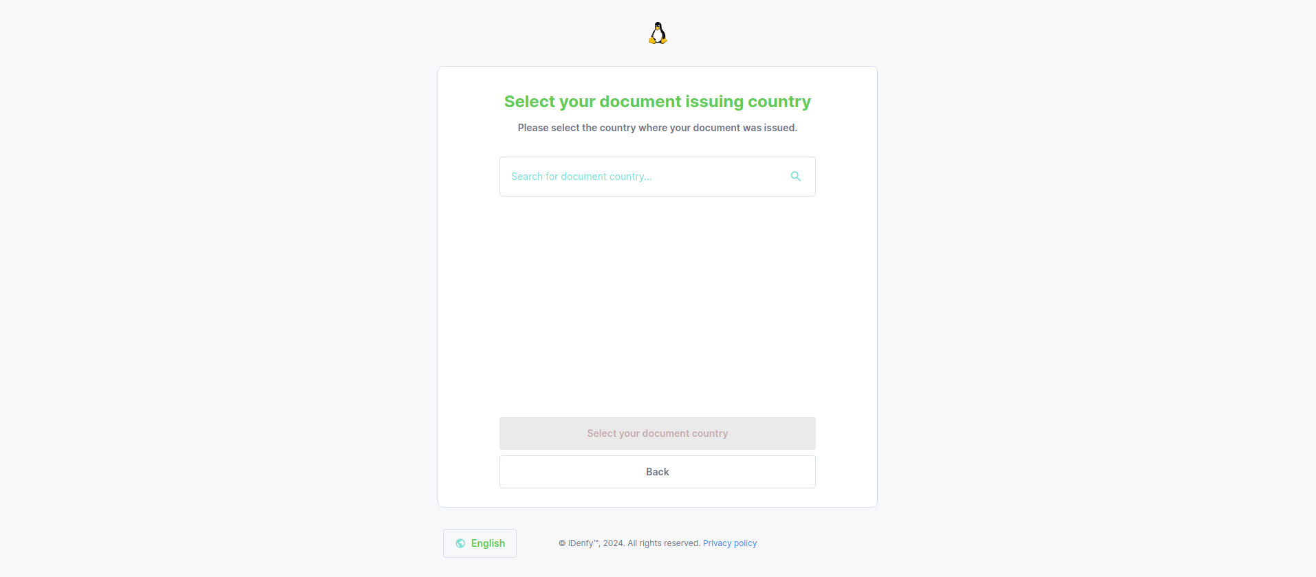
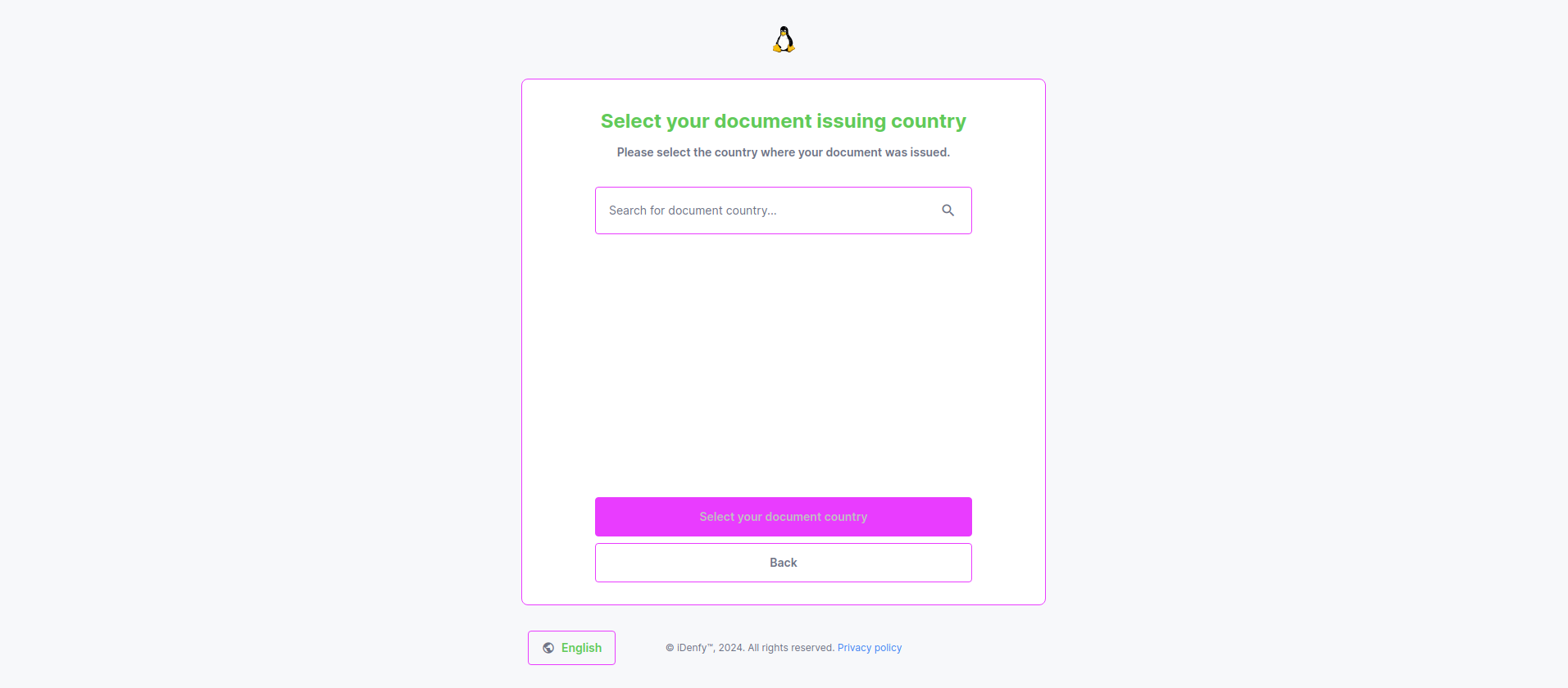
Disabled button color
You can change the color of disabled buttons.
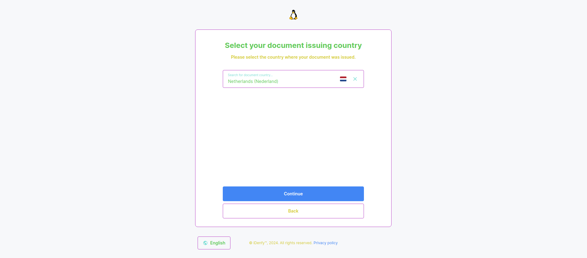
Typography(text) color
You can change the non primary and secondary color of the text.
"Success!" icon color
You can change the icon color in the "Success" window.
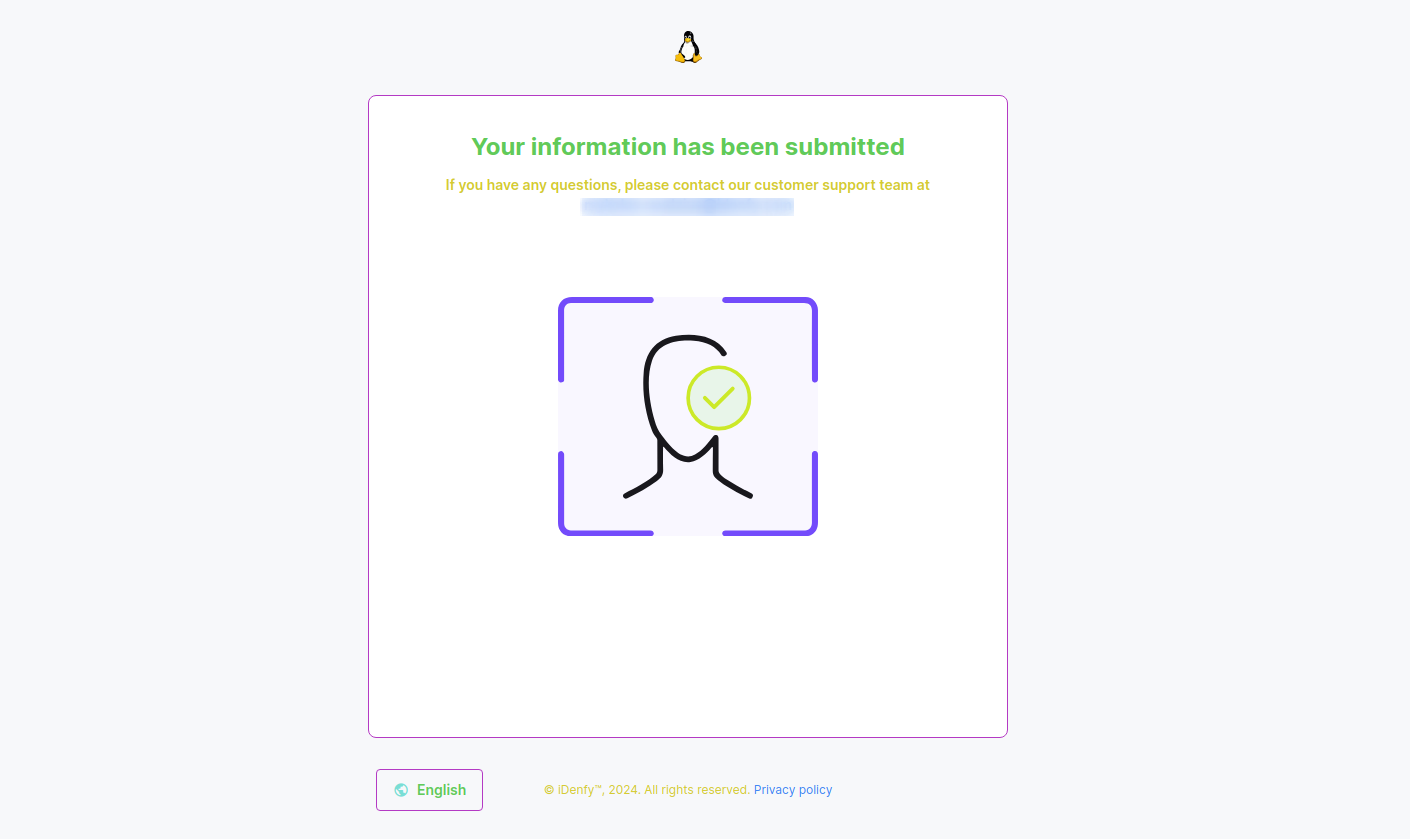
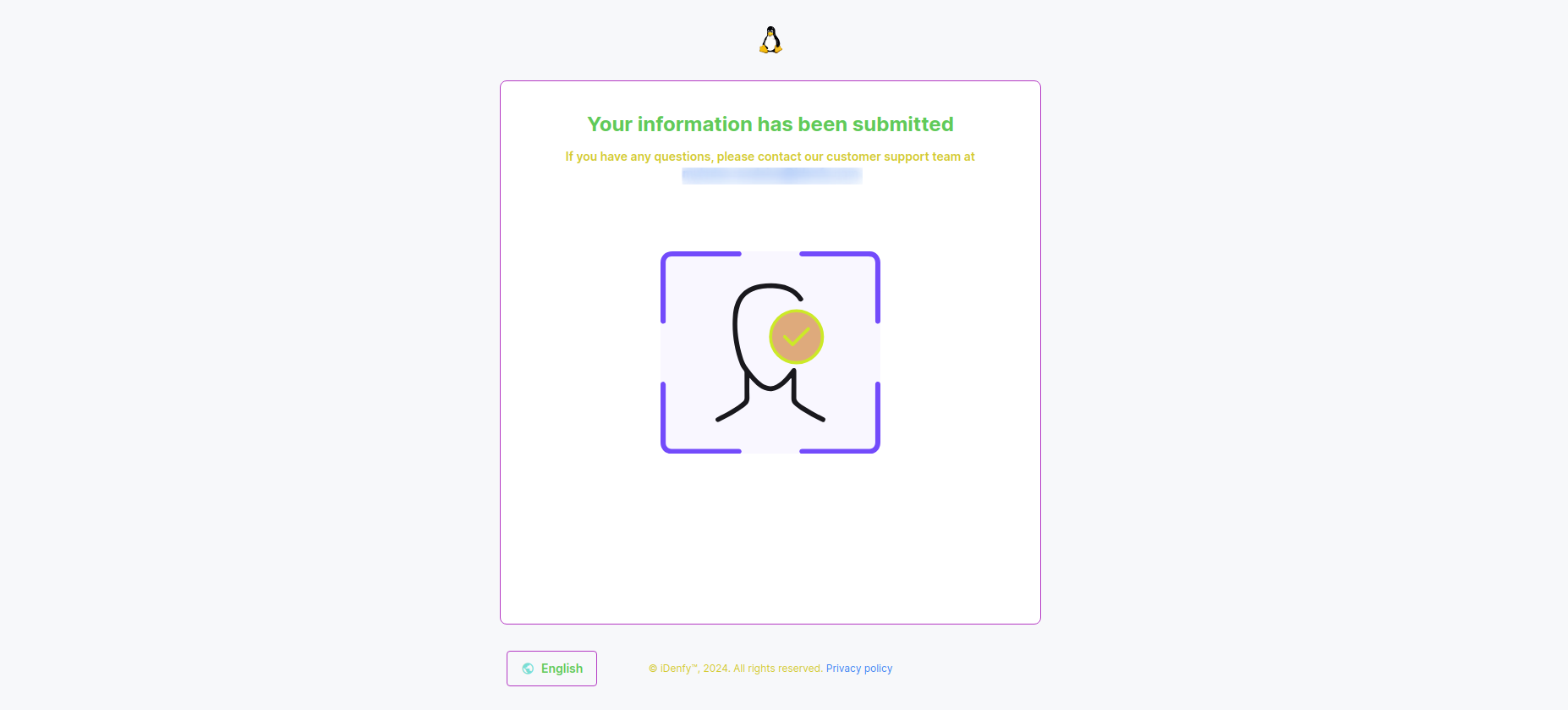
"Success!" icon background color
You can change the background icon color in the "Success" window.
"Error" icon color
You can change the error icon color.
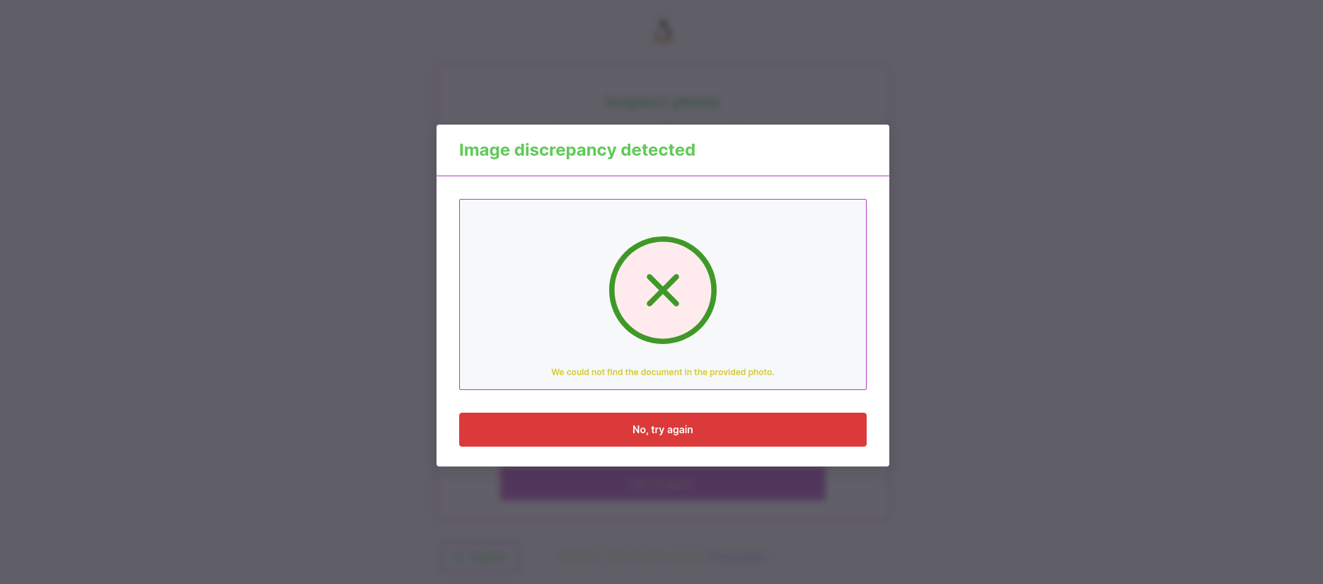
"Error" icon background color
You can change the error icon background color.

"Warning" icon color
You can change the color of the warning icon.
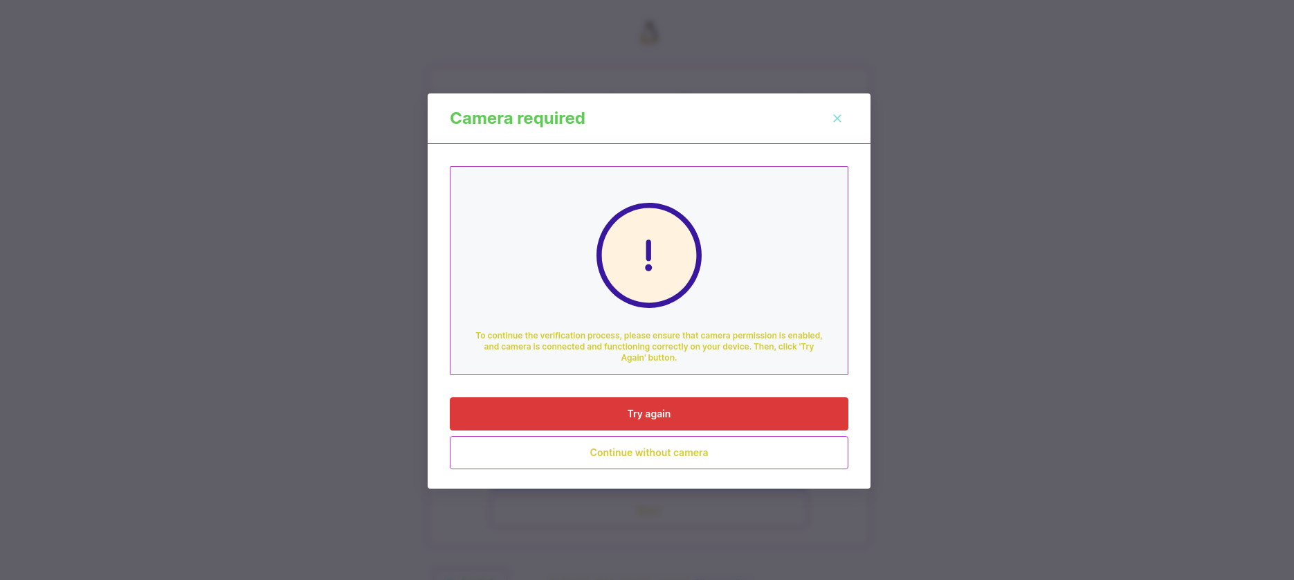
"Warning" icon background color
You can change the background color of the warning icon.
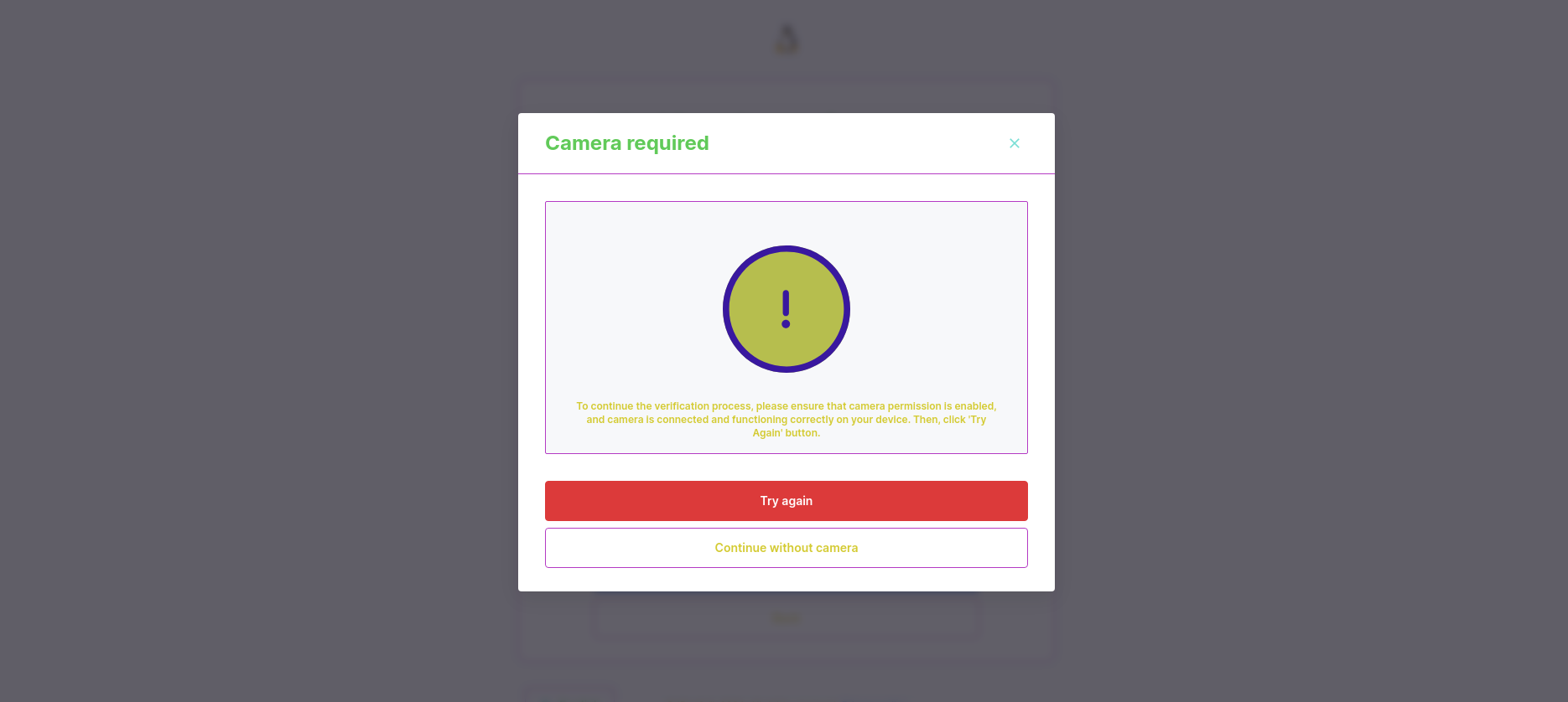
Info message icon color
You can change the color of info message icon(s).
Info message background color
You can change the background color of info message.
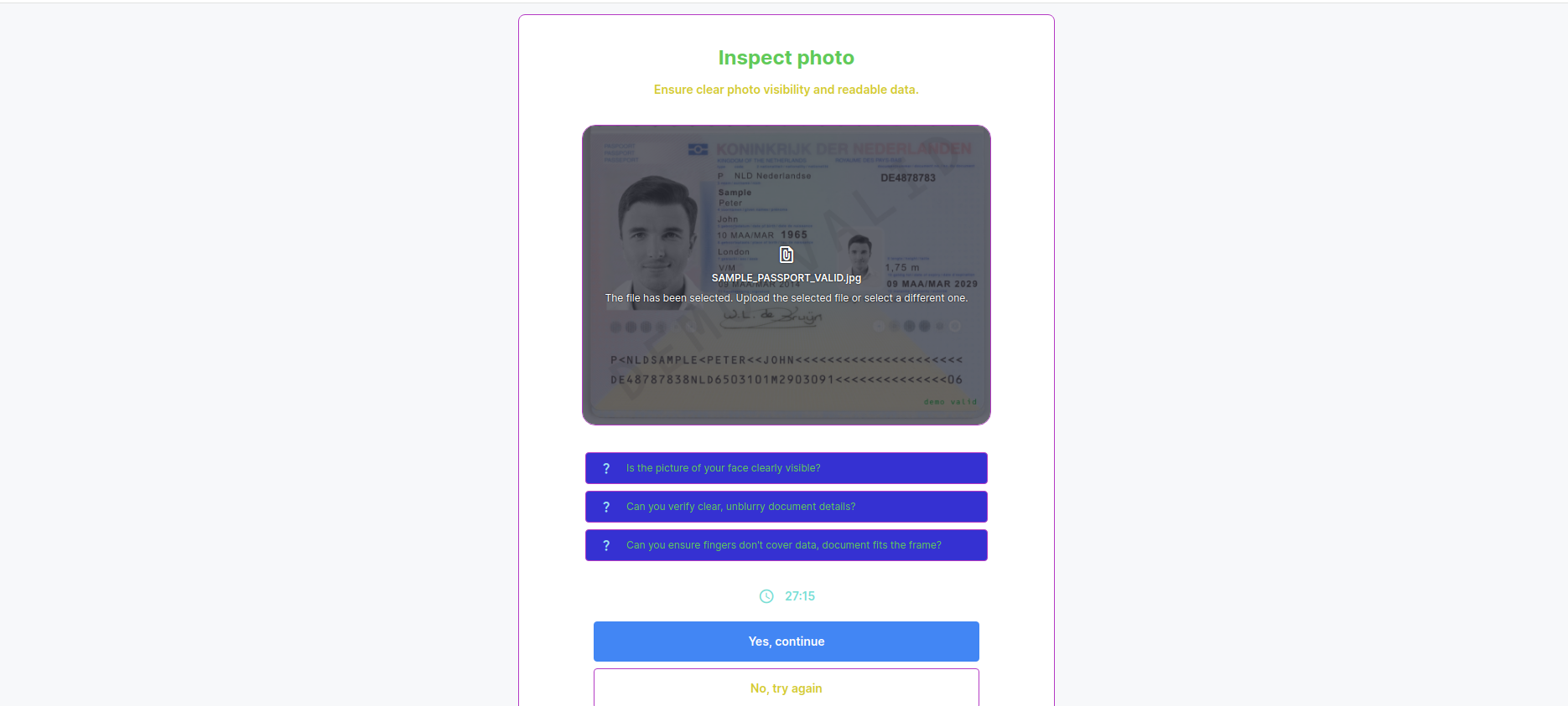
Primary background color
You can change the primary background color.
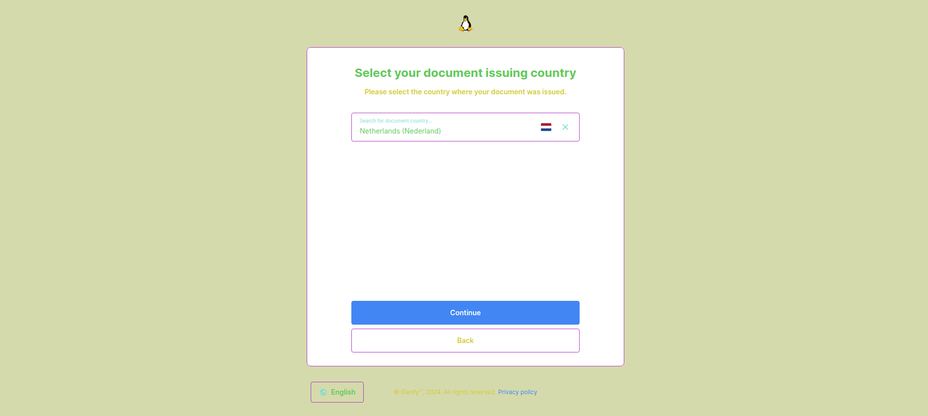
Secondary background color
You can change the secondary background color.
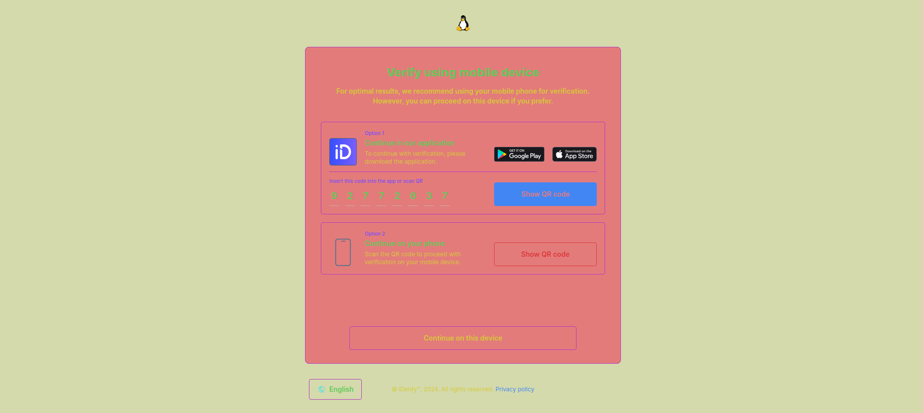
Additional personalisation settings
Support email
You can add a default support email visible to your customers.
Minimum and recommended camera quality
There is a possibility to add minimum and recommended camera quality for your users.
The accepted input is camera's resolution, for example: 1280×720.
If the client's camera resolution is less than the specified minimum, the verification will not take place and the user will be prompted to select alternative verification methods (Show alternative methods setting must be turned on).
The specified recommendation will be showed to the user in the verification session.
Additional customization and white label features
Immediate redirect
Immediate redirect can be turned on if you want your users to be redirected back to "Success" or "Failed" URL, depending on the automatic check results. Redirection is done immediately after they submit the verification and pass the automatic check. This way they won't be seeing the waiting window for human supervision confirmation.
Skip waiting for results
With this option turned on, your user will be immediately redirected to "unverifiedUrl" after they submit the verification. This way they won't be waiting for automatic check results. This option is used together with immediate redirect.
Show iDenfy water mark
You can choose whether to show iDenfy's watermark in verification screen or not.
Show alternative methods
Alternative methods allow users to continue verification on another platform. If the options is turned off, the users will have to complete the verification on platform that they are currently in.
Show header timer
This option allows the users to see their session time left.
Show footer
This option allows you to enable or disable bottom copyright text on verification screens.