KYC (identity verification) branding is managed separately under Settings → Know Your Customer (KYC) → Branding. Both products share the same multi-theme management interface. See Branding (KYC).
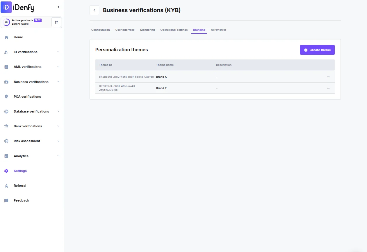
Managing Themes
The Personalization themes overview lists all configured themes:
Click Create theme to add a new theme. Use the action menu on any existing theme row to edit or delete it.
Creating or Editing a Theme
Configuration
UI Files
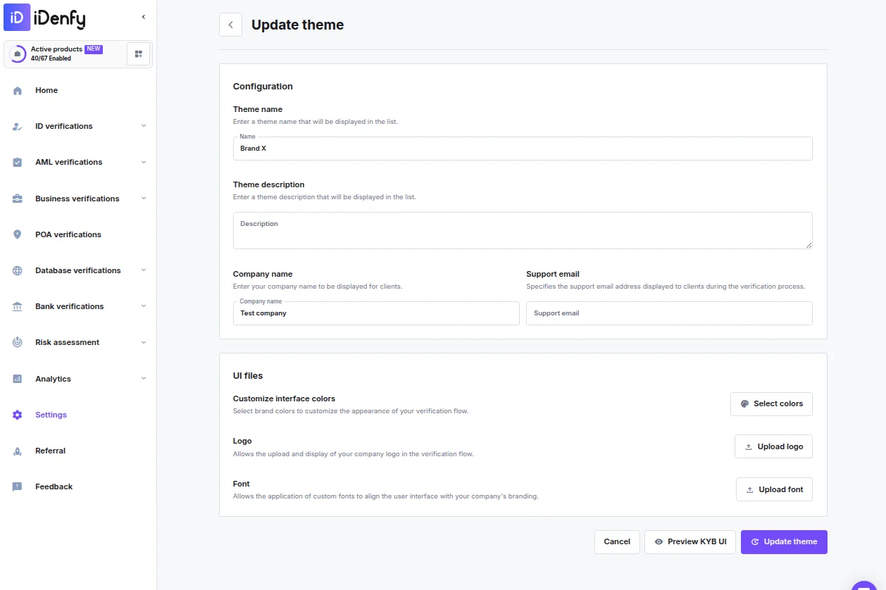
Interface Colors
Click Select colors to open the color picker. Colors are split across two tabs: Main UI colors
Other UI colors — Additional interface color overrides.
Click Save when done.