Your existing KYC branding settings have been automatically migrated to a Default theme. No reconfiguration is required.
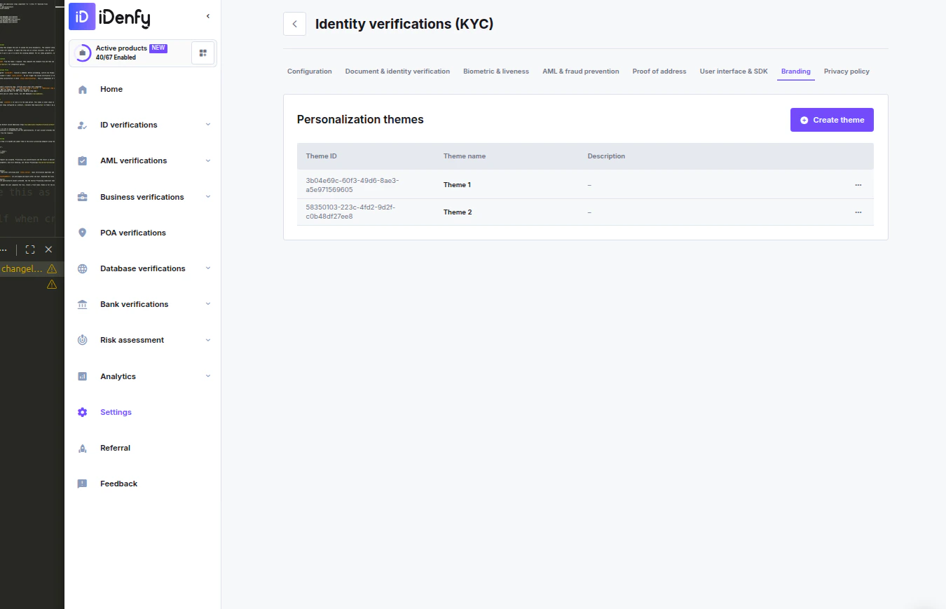
Managing Themes
The Personalization themes overview lists all configured themes:
Click Create theme to add a new theme. Use the action menu on any existing theme row to edit or delete it.
Creating or Editing a Theme
Configuration
UI Files
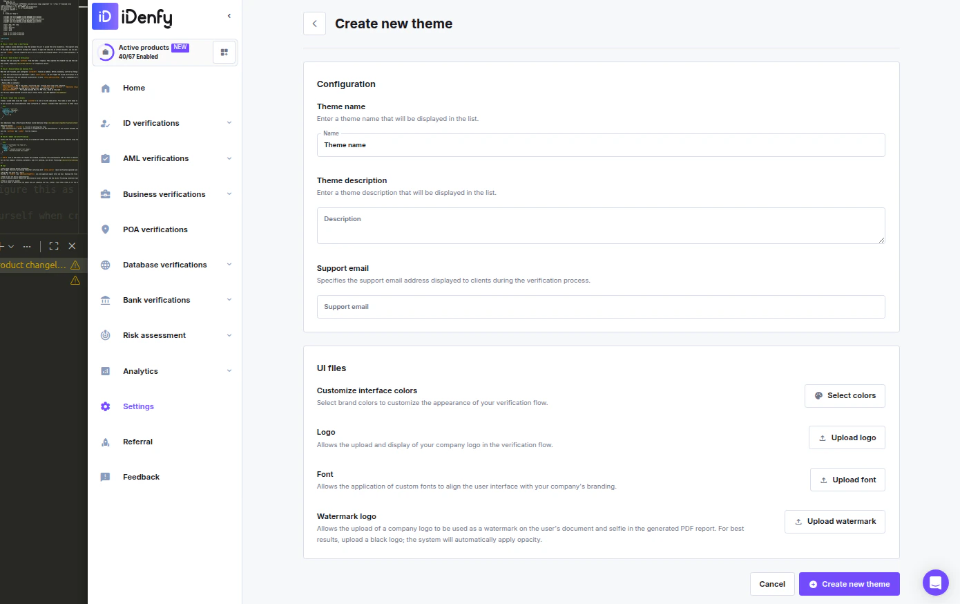
Interface Colors
Click Select colors to open the color picker. Colors are split across two tabs: Main UI colors
Other UI colors — Additional interface color overrides.
Click Save when done.
Assigning a Theme
A theme can be applied in two ways:- Per magic link — When creating or editing a magic link, enable the Custom theme toggle in the Configuration section and select a theme from the dropdown. See Verification via Magic Link.
- Per flow configuration — Select a theme in the KYC flow settings so every session created with that flow uses the assigned branding automatically.
If no theme is assigned, the Default theme is used automatically.
Branding and user flow limitationsDuring verification, all texts are predefined and are not editable. These include localization, titles, descriptions, and all status messages.
Need adjustments? If your localization needs adjustments, contact us.