This area allows you to fully white-label the verification interface to ensure a seamless visual transition for your users. Location: Settings → Know Your Customer (KYC) → BrandingDocumentation Index
Fetch the complete documentation index at: https://documentation.idenfy.com/llms.txt
Use this file to discover all available pages before exploring further.
Settings Example
Settings Example
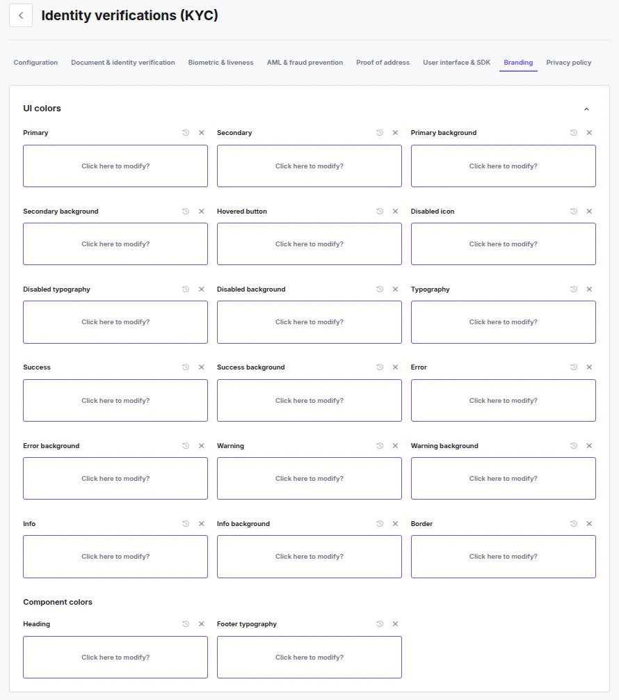
UI Colors
You have granular control over the color palette to match your brand guidelines exactly. You can configure colors for general layout, specific interaction states, and text.General & Brand
- Primary & Secondary — Define your main brand colors used for buttons, highlights, and key elements.
- Backgrounds — Set the Primary and Secondary background colors to control the overall canvas of the application.
- Typography — Define the default color for main body text.
- Borders — Set a standard color for input field borders and dividers.
Feedback States
Customize the colors used to communicate status updates to the user. For each state, you can define both the Icon/Text color and the Background color.- Success — Used for approved steps or completed actions.
- Error — Used for failed checks or validation errors.
- Warning — Used for alerts like “low image quality.”
- Info — Used for neutral informational messages.
Interaction States
- Hovered button — The color of a button when a user hovers over it.
- Disabled — Define the appearance (Icon, Typography, and Background) for elements that are currently inactive or non-clickable.
Component Colors
- Heading — Specific color override for page headings (
h1,h2, etc.). - Footer typography — Specific color for text appearing in the footer area.
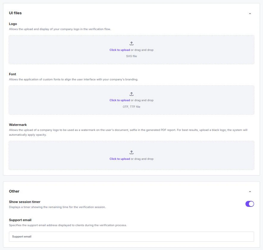
UI Files
Upload your visual assets to replace the default branding.- Logo — Upload your company logo to appear in the header of the verification flow.
- Accepted format: SVG
- Font — Upload your proprietary or brand font to apply it to all text within the interface.
- Accepted formats:
.otf,.ttf
- Accepted formats:
- Watermark — When uploaded via the Dashboard, your custom watermark is automatically applied at a default 15% opacity to the end user’s main IDV photos (Face, Document front, Document back) for Verification PDFs.
- Accepted format: PNG
Watermark Examples
Watermark Examples

Other Settings
- ⏱️ Show session timer — Displays a countdown timer on the screen, showing the user exactly how much time remains before their verification session expires.
- 📧 Support email — Specify a support email address displayed to the user during the flow, providing them with a direct contact method should they encounter issues.
Branding and user flow limitationsDuring verification, all texts are predefined and are not editable. These texts include:
- Localization and translations
- Titles
- Descriptions
- Warning messages
- Success messages
- Failure messages
- Error messages
Need adjustments? If your localization needs adjustments, contact us.